- Subscribe to RSS Feed
- Mark Topic as New
- Mark Topic as Read
- Float this Topic for Current User
- Bookmark
- Subscribe
- Printer Friendly Page
- Mark as New
- Bookmark
- Subscribe
- Mute
- Subscribe to RSS Feed
- Permalink
- Report Inappropriate Content
The latest app update is a downgrade as far as I'm concerned
Why have you removed the simple indicators of battery level and now you have to click further into the app to find them, who thought that was a good idea.
Solved! Go to Solution.
- Related Labels:
-
Online and Mobile Apps
- Mark as New
- Bookmark
- Subscribe
- Mute
- Subscribe to RSS Feed
- Permalink
- Report Inappropriate Content
The new interface that ARLO is using is just like what KUNA and YIHOME uses, top and down scrolling. It is stupid and not ideal.
The biggest reason why I LOVED ARLO was because its interface, for the ability to see multiple cameras at the same time and for all the various status info right on the home screen, especially when you are using iPad with a large screen. the Top/Down scrolling works fine for a phone screen, but not on a tablet.
I really hope that ARLO knows that they are doing something truly stupid here by going back in time in terms of design and usability.
- Mark as New
- Bookmark
- Subscribe
- Mute
- Subscribe to RSS Feed
- Permalink
- Report Inappropriate Content
The website still has the icons on the main page (at least for me) as well as the newer format on the settings screen. Was it an oversight or bug in the app update that removed these from the device screen or was it intentional. Regardless, I have already ditched my Netgear router and repeater this year due to constant and buggy software/firmware that was also said to "improve the user experience" but did just the opposite and now Arlo seems to be heading down that same path. More clicks and drilling down to get basic status information is NOT an improvement nor does it do anything but worsen the user experience. There was much more to the older interface than this disaster. A step back to the previous version would be a HUGE "improvement" over this version.
- Mark as New
- Bookmark
- Subscribe
- Mute
- Subscribe to RSS Feed
- Permalink
- Report Inappropriate Content
- Mark as New
- Bookmark
- Subscribe
- Mute
- Subscribe to RSS Feed
- Permalink
- Report Inappropriate Content
- Mark as New
- Bookmark
- Subscribe
- Mute
- Subscribe to RSS Feed
- Permalink
- Report Inappropriate Content
Upgrade is absolutely a step backwards.... way backwards! Horrible interface. I now can’t see all three of my cameras on one screen on my iPad, battery level and WiFi level (both of which are crucial for me) are no longer visible without clicking through menus. STill haven’t really figured out how to talk through my Arlo yet... The live view lagg is unacceptable and is a real game changer for me... I will pursue returning my entire system through Amazon if this is not resolved soon. While watching live view this morning I heard my garage door open, my house door opened and my daughters boyfriend came in my house.... all before the live view even showed his truck coming down the street! This renders this system USELESS for me! Netgear, RESOLVE THIS NOW! I am utterly disgusted.
- Mark as New
- Bookmark
- Subscribe
- Mute
- Subscribe to RSS Feed
- Permalink
- Report Inappropriate Content
"ADDING"
I can't wait to trash this inferior Arlo "Security system.
My nieghbor has a wifi security system that works flawlessly with awesome support.
- Mark as New
- Bookmark
- Subscribe
- Mute
- Subscribe to RSS Feed
- Permalink
- Report Inappropriate Content
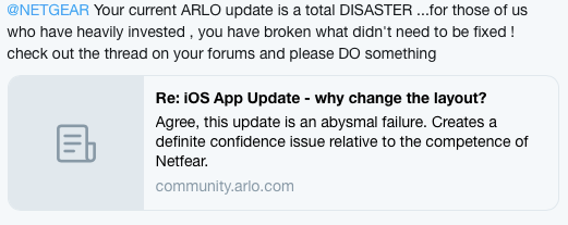
Agree, this update is an abysmal failure. Creates a definite confidence issue relative to the competence of Netfear.
- Mark as New
- Bookmark
- Subscribe
- Mute
- Subscribe to RSS Feed
- Permalink
- Report Inappropriate Content
- Mark as New
- Bookmark
- Subscribe
- Mute
- Subscribe to RSS Feed
- Permalink
- Report Inappropriate Content
I noticed my old iPhone 4S didn't get this update so it still has the old layouts.
- Mark as New
- Bookmark
- Subscribe
- Mute
- Subscribe to RSS Feed
- Permalink
- Report Inappropriate Content
Well.......the posts here of REAL customers who have heavily invested in this product (me included- 6 cameras and 2 basestations ) are hardly glowing congratulations to NETGEAR
The measure of how much they actually CARE about those customers will be very obvious from their reposonse (or not ) to this update debacle
not holding my breath....
Bill P
- Mark as New
- Bookmark
- Subscribe
- Mute
- Subscribe to RSS Feed
- Permalink
- Report Inappropriate Content
Guys, can I suggest that you do two things. Head over to Twitter and publicly announce the failure of this update so others can see the incompetence of The Nethear/Arlo development team, and two, head over to the iOS App Store,
locate the arlo app and leave an honest review so other potential investors can see what it going on here before they waste their money on this so called security system.
Clearly The Netgear/Arlo team aren’t listening to us in here so I think it’s time to take this frustration to a more public arena.
Netgear......shame on you for not carrying out proper user acceptance testing both internally and publicly before releasing your updates. You are so far disconnected from your user community it’s a disgrace! The cost of these devices and the safety nature of their delivered services should demand even more stringent UAT than most software.
- Mark as New
- Bookmark
- Subscribe
- Mute
- Subscribe to RSS Feed
- Permalink
- Report Inappropriate Content
Twitter done...though again, not holding my breath !
I did however earn a new badge from netgear for my posts here , so that makes up for it all ....... !!
Hi wakevortex,
You just earned a new badge!
![]()
10 Replies Posted
You've replied to 10 posts. Thanks for keeping the conversation going!
- Mark as New
- Bookmark
- Subscribe
- Mute
- Subscribe to RSS Feed
- Permalink
- Report Inappropriate Content
Hahhaha! Me too!!!!! So many badges, so non-existent customer support replies. Who releases a brand new ‘update’ then leaves for the weekend????? FAILURE ALL THE WAY AROUND.
- Mark as New
- Bookmark
- Subscribe
- Mute
- Subscribe to RSS Feed
- Permalink
- Report Inappropriate Content
I like other features of the new app but the ones above are driving me nuts.
- Mark as New
- Bookmark
- Subscribe
- Mute
- Subscribe to RSS Feed
- Permalink
- Report Inappropriate Content
This new Android update has rendered the Arlo app pretty much useless. I have no access to camera settings or status in the settings area. All I can do is delete or change the device name. I notice others are able to see status in the settings area. This app update blows!!
- Mark as New
- Bookmark
- Subscribe
- Mute
- Subscribe to RSS Feed
- Permalink
- Report Inappropriate Content
after
AFree the latest Arlo app upgrade I am no longer see badge notictions when something has been recorded. Normally you get the number of recordings but not getting anything now
- Mark as New
- Bookmark
- Subscribe
- Mute
- Subscribe to RSS Feed
- Permalink
- Report Inappropriate Content
Totally discussed with the New app.... No notice, No Text, No Phone Call as a warning... This version is to say the least disappointing. I cannot check my cameras at a glance. I have no idea how many motions have been detected at any one time. Honestly what were you thinking ??? I have called support twice today asking to get the old very effective version back and they said so sorry this is what I will have to use until a new one comes out... I only hope you can get your act together. SOON !
- Mark as New
- Bookmark
- Subscribe
- Mute
- Subscribe to RSS Feed
- Permalink
- Report Inappropriate Content
(2) Arlo Pro (VMC4030)
VMB4000 Base
Recent software update 2.6.0_22600 from 10-20-18 has broken the ability to select from which camera I can view the particular prior library of videos. There used to be a button next to the "settings gear" that allowed access to the library videos from any of my three cameras, but now that button is gone if there are "0" unplayed videos. This button used to show "0" and selecting it would bring you to the library for that camera so you could access older already viewed recorded videos from prior time or dates.
Someone at Netgear/Arlo decided "why would anyone need a button to get to "0" new videos?" and promptly decided to take that out and only present the video button if there were at least "1" unviewed video! This, of course, broke the ability to enter the library section for that camera once all "new" videos were reviewed!
Geez, software engineers need to realize the full ramifications of changes they make to different actions in a software flow. What ever happened to the old adage "If it ain't broke dont fix it!"?
Now, the only "work around" I can think of is to go outside, force the camera to record a useless video so there is a new video, which then presents a library button for that camera so older videos (say from two days earlier) can be selected and viewed.
Please but back the ability for cameras to present a "0" new videos button so us users/customers can access our prior, already viewed, videos.
Thanks!
- Mark as New
- Bookmark
- Subscribe
- Mute
- Subscribe to RSS Feed
- Permalink
- Report Inappropriate Content
Hi. I have exactly the same issue. On my iPad Pro in landscape won’t work on live. Even on portrait it does not work correctly. The viewing screen are full screen. But none of the cameras work. I am so over all the issues I have had with ARLO. nothing but problems. It will probably never get fixed. This update 2.6.0 has destroyed the camera system. Don’t wast your money buying Arlo. Full of bugs and other issues. I have tried everything to fix it such us deleting the app about 20 times. Tried all the settings. Even tried to find the old app to re install it. Nothing.
- Mark as New
- Bookmark
- Subscribe
- Mute
- Subscribe to RSS Feed
- Permalink
- Report Inappropriate Content
- Mark as New
- Bookmark
- Subscribe
- Mute
- Subscribe to RSS Feed
- Permalink
- Report Inappropriate Content
and another ...2 in an hour...FIX MY APP!!!!
You just earned a new badge!
![]()
5 Kudos Received
You've received 5 Kudos! Keep up the great work!
- Mark as New
- Bookmark
- Subscribe
- Mute
- Subscribe to RSS Feed
- Permalink
- Report Inappropriate Content
"Clearly The Netgear/Arlo team aren’t listening to us in here so I think it’s time to take this frustration to a more public arena."
In all fairness... it is Sunday! Lets give them a few days to realised this stupid mistake.
Have tweeted them this page
- Mark as New
- Bookmark
- Subscribe
- Mute
- Subscribe to RSS Feed
- Permalink
- Report Inappropriate Content
I saw the redesigned app in an iPad. Wow, that's very bad like no status on the home page. Please bring them back. It's annoying to check each camera's ... icon for them. 😞
I also made a feedback idea to bring back the old design: https://community.arlo.com/t5/Arlo-Idea-Exchange/Bring-back-the-old-design-for-iOS-app/idi-p/1642852.
- Mark as New
- Bookmark
- Subscribe
- Mute
- Subscribe to RSS Feed
- Permalink
- Report Inappropriate Content
- Mark as New
- Bookmark
- Subscribe
- Mute
- Subscribe to RSS Feed
- Permalink
- Report Inappropriate Content
The previous old iOS app design was fine since its home page showed the status like the cameras' batteries, signals, power, etc. The updated app from Friday is very different and annoying. User has to go to each camera to see them. Why not see them on home page like it used to do?
-
Apple HomeKit
1 -
Arlo Mobile App
496 -
Arlo Pro
27 -
Arlo Pro 2
1 -
Arlo Pro 3
2 -
Arlo Secure
1 -
Arlo Smart
108 -
Arlo Ultra
1 -
Arlo Web and Mobile Apps
6 -
Arlo Wire-Free
10 -
Before You Buy
1,214 -
Discovery
1 -
Features
250 -
Firmware
1 -
Firmware Release Notes
119 -
Hardware
2 -
IFTTT
1 -
IFTTT (If This Then That)
48 -
Installation
1,440 -
Installation & Upgrade
1 -
Online and Mobile Apps
1,266 -
Partner Integrations
1 -
Security
1 -
Service and Storage
563 -
Smart Subscription
1 -
SmartThings
39 -
Software & Apps
1 -
Troubleshooting
7,413 -
Videos
1
- « Previous
- Next »


