This topic has been closed to new posts due to inactivity. We hope you'll join the conversation by posting to an open topic or starting a new one.
New update is awful
- Subscribe to RSS Feed
- Mark Topic as New
- Mark Topic as Read
- Float this Topic for Current User
- Bookmark
- Subscribe
- Printer Friendly Page
- Mark as New
- Bookmark
- Subscribe
- Mute
- Subscribe to RSS Feed
- Permalink
- Report Inappropriate Content
This is update they forced down our throats is awful. Now nothing works and the way you program things makes no sense. Whoever the idiot is that designed this should be fired
- Related Labels:
-
Features
- Mark as New
- Bookmark
- Subscribe
- Mute
- Subscribe to RSS Feed
- Permalink
- Report Inappropriate Content
The updated app throws out all the programing you used to have and makes zero sense anymore. I have no idea why they did this and what idiot designed the new system. I suspect he is a tech guy that hasn't met a person to communicate with in years. You know how Apple makes things intuitively simple, this is the opposite of that.
- Mark as New
- Bookmark
- Subscribe
- Mute
- Subscribe to RSS Feed
- Permalink
- Report Inappropriate Content
I would imagine that the new UI is designed to make arlo more money. This is likely the reason you can’t revert it. Going back reduces arlo revenue.
- Mark as New
- Bookmark
- Subscribe
- Mute
- Subscribe to RSS Feed
- Permalink
- Report Inappropriate Content
Jshuckell,
Is there a specific feature or aspect of the updated UI you're having trouble with? Let us know the details and we may be able to assist here on the community.
JamesC
- Mark as New
- Bookmark
- Subscribe
- Mute
- Subscribe to RSS Feed
- Permalink
- Report Inappropriate Content
@DannyBearAgain wrote:
I would imagine that the new UI is designed to make arlo more money. This is likely the reason you can’t revert it. Going back reduces arlo revenue.
I don't think that's it. I think they genuinely believed it offered a better experience, and thought all users would be on the new UI by now. In some respects it is better organized. But they failed to consider some pretty common use cases, so there are things that could be done fairly easily before, and are either difficult or even impossible to do now.
Their ability to fix the issues people here have raised is limited, because they (mistakenly) hard-wired the home security system with buttons for each the the three modes. Reversion would have to be limited to people who didn't purchase the security system, and supporting two UIs forever is clearly not a viable plan.
FWIW, the idea of "home" "away" and "standby" isn't something Arlo came up with it, there are quite a few other security systems that are built on that framework.
- Mark as New
- Bookmark
- Subscribe
- Mute
- Subscribe to RSS Feed
- Permalink
- Report Inappropriate Content
What happened to the colored zones ? So you can block out things to no be notified on ...it's gone or where can I find it please. ?
- Mark as New
- Bookmark
- Subscribe
- Mute
- Subscribe to RSS Feed
- Permalink
- Report Inappropriate Content
@Mustang860 wrote:
What happened to the colored zones ? So you can block out things to no be notified on ...it's gone or where can I find it please. ?
Activity zones are still there. Go to the devices page, then select the three dots on the upper right. Then the settings wheel for each camera should appear. Select the settings wheel for the appropriate camera, and you will see an entry for activity zones.
- Mark as New
- Bookmark
- Subscribe
- Mute
- Subscribe to RSS Feed
- Permalink
- Report Inappropriate Content
That is wrong,but I found it..
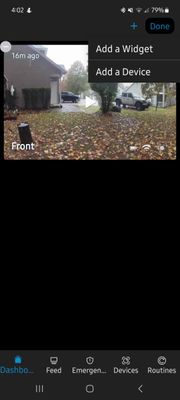
Those 3 dots don't bring me to settings, asked if I want a widget.. somehow I found it though if you touch the screen at the 9:00 position, the settings star shows up in the top right corner... and then it's business as usual , like the old format, thank you for your help, take a look at that and you'll see what I mean..
- Mark as New
- Bookmark
- Subscribe
- Mute
- Subscribe to RSS Feed
- Permalink
- Report Inappropriate Content
@Mustang860 wrote:
That is wrong,but I found it..
Those 3 dots don't bring me to settings, asked if I want a widget..
I think you must have beeen on the dashboard screen - not the devices screen.
You can't add widgets to the devices screen.
- Mark as New
- Bookmark
- Subscribe
- Mute
- Subscribe to RSS Feed
- Permalink
- Report Inappropriate Content
- Mark as New
- Bookmark
- Subscribe
- Mute
- Subscribe to RSS Feed
- Permalink
- Report Inappropriate Content
Maybe,I don't know but I think I'm set now..thank you
- Mark as New
- Bookmark
- Subscribe
- Mute
- Subscribe to RSS Feed
- Permalink
- Report Inappropriate Content
As I thought. You are on the Dashboard screen (I can see the highlight on the bottom left).
You get to the Devices screen by pressing on the choice immediately to the left of Routines.
-
Arlo Essential Spotlight
2 -
Arlo Mobile App
335 -
Arlo Secure
1 -
Arlo Smart
127 -
Before You Buy
228 -
Bevor Sie kaufen
1 -
Detección de Movimiento
1 -
Dépannage
1 -
Features
275 -
Installation
344 -
offline
1 -
Online and Mobile Apps
1 -
Online und mobile Apps
1 -
receipts
1 -
totally frustrated
1 -
Troubleshooting
1,585 -
VMC2030
2 -
VMC2030-100EUS
2 -
Warranty & Contracts
1
- « Previous
- Next »

