Display View Changed - Multi Cameras
- Subscribe to RSS Feed
- Mark Topic as New
- Mark Topic as Read
- Float this Topic for Current User
- Bookmark
- Subscribe
- Printer Friendly Page
- Mark as New
- Bookmark
- Subscribe
- Mute
- Subscribe to RSS Feed
- Permalink
- Report Inappropriate Content
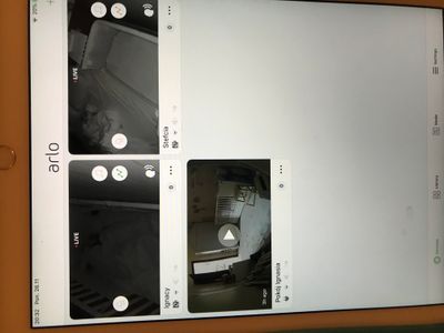
We have 2 arlo baby cameras. Previously the two cameras would fill the screen nicely and we could view both kids easily.
With the latest app update the layout is designed as if we had 9 cameras but are only using 2 slots. Everything is tiny.
Please either go back to the old layout or let me customize how I view my cameras. Clearly this update was rolled out for those who have many arlo security cameras but is not a good option for those of us with Arlo Babies.
- Related Labels:
-
Troubleshooting
- Mark as New
- Bookmark
- Subscribe
- Mute
- Subscribe to RSS Feed
- Permalink
- Report Inappropriate Content
What device are you using?
- Mark as New
- Bookmark
- Subscribe
- Mute
- Subscribe to RSS Feed
- Permalink
- Report Inappropriate Content
Mavin
Can you provide a screenshot of what you are seeing.
- Mark as New
- Bookmark
- Subscribe
- Mute
- Subscribe to RSS Feed
- Permalink
- Report Inappropriate Content
thats how it looks on ipad air 2
- Mark as New
- Bookmark
- Subscribe
- Mute
- Subscribe to RSS Feed
- Permalink
- Report Inappropriate Content
Same issue with 3 cameras:

- Mark as New
- Bookmark
- Subscribe
- Mute
- Subscribe to RSS Feed
- Permalink
- Report Inappropriate Content
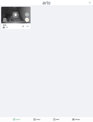
1 camera here.. this is what it looks like on an ipad... Ridiculous!!!
- Mark as New
- Bookmark
- Subscribe
- Mute
- Subscribe to RSS Feed
- Permalink
- Report Inappropriate Content
iPad Air 2 16GB Wi-Fi MGLW2FD/A
ios: ios 12.1 (16B92)
- Mark as New
- Bookmark
- Subscribe
- Mute
- Subscribe to RSS Feed
- Permalink
- Report Inappropriate Content
10.5" ipad pro... ios 12.1
- Mark as New
- Bookmark
- Subscribe
- Mute
- Subscribe to RSS Feed
- Permalink
- Report Inappropriate Content
Any info on why display changed and is anything being done to address?
- Mark as New
- Bookmark
- Subscribe
- Mute
- Subscribe to RSS Feed
- Permalink
- Report Inappropriate Content
With recent app updates, design changes have been made in an effort to streamline the interface for ease of use. I understand in this case, it would be useful to allow some customization options to expand the size of the camera widget based on the number of cameras on your account. Thanks for bringing up this concern, I will pass this feedback along to the app team.
JamesC
- Mark as New
- Bookmark
- Subscribe
- Mute
- Subscribe to RSS Feed
- Permalink
- Report Inappropriate Content
I also have this same issue and I’m sure along with thousands of others, I think it’s ridiculous to have made this change, obviously without considering the ramifications it incurs! Why doesn’t your team at least reach out, test, inquire, etc., with the beholders of this equipment, and even just maybe offer adjustments for us to choose how we view our camera or cameras! Fix it soon, soon, soon!
WHY?
-
Apple TV App
2 -
Arlo Baby
4 -
Arlo Mobile App
127 -
Arlo Smart
13 -
Arlo Wire-Free
1 -
Batteries
1 -
Before You Buy
142 -
Features
36 -
Firmware Release Notes
10 -
IFTTT (If This Then That)
4 -
Installation
101 -
Online and Mobile Apps
143 -
Service and Storage
23 -
SmartThings
1 -
Troubleshooting
831


