- Subscribe to RSS Feed
- Mark Topic as New
- Mark Topic as Read
- Float this Topic for Current User
- Bookmark
- Subscribe
- Printer Friendly Page
- Mark as New
- Bookmark
- Subscribe
- Mute
- Subscribe to RSS Feed
- Permalink
- Report Inappropriate Content
Regarding the new live feed under the latest App update: the alarm banner partially blocks of the view.
I understand why it put there, to easily access the alarm, but I don't think it's a good idea.
Solved! Go to Solution.
- Related Labels:
-
Online and Mobile Apps
Accepted Solutions
- Mark as New
- Bookmark
- Subscribe
- Mute
- Subscribe to RSS Feed
- Permalink
- Report Inappropriate Content
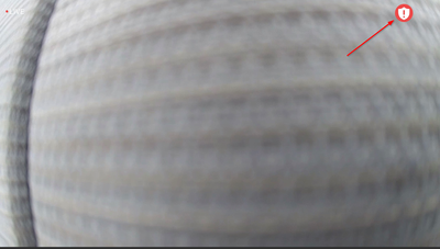
We wanted to update everyone when you're viewing in landscape full screen, you should not see the "alarm" bar obscuring the live stream video; instead you should see a red-white shield icon on the top-right hand corner on the full screen video.
- Mark as New
- Bookmark
- Subscribe
- Mute
- Subscribe to RSS Feed
- Permalink
- Report Inappropriate Content

- Mark as New
- Bookmark
- Subscribe
- Mute
- Subscribe to RSS Feed
- Permalink
- Report Inappropriate Content
What do you mean by "video screen?" The Devices tab where you can live view? If so, the alarm is now able to be selected by a pull-down tab (Android) or gray strip (iOS) near the top of the screen but should normally remain out of view until you click on it.
- Mark as New
- Bookmark
- Subscribe
- Mute
- Subscribe to RSS Feed
- Permalink
- Report Inappropriate Content
Just an FYI - there were people who complained loudly here about the previous location of the alarm which is at least partly why it got rearranged.
- Mark as New
- Bookmark
- Subscribe
- Mute
- Subscribe to RSS Feed
- Permalink
- Report Inappropriate Content
I needs moving. Or making smaller.
- Mark as New
- Bookmark
- Subscribe
- Mute
- Subscribe to RSS Feed
- Permalink
- Report Inappropriate Content

- Mark as New
- Bookmark
- Subscribe
- Mute
- Subscribe to RSS Feed
- Permalink
- Report Inappropriate Content
- Mark as New
- Bookmark
- Subscribe
- Mute
- Subscribe to RSS Feed
- Permalink
- Report Inappropriate Content
Mine disappears once I click on it for the first time. Have you tried that?
- Mark as New
- Bookmark
- Subscribe
- Mute
- Subscribe to RSS Feed
- Permalink
- Report Inappropriate Content

- Mark as New
- Bookmark
- Subscribe
- Mute
- Subscribe to RSS Feed
- Permalink
- Report Inappropriate Content

- Mark as New
- Bookmark
- Subscribe
- Mute
- Subscribe to RSS Feed
- Permalink
- Report Inappropriate Content
- Mark as New
- Bookmark
- Subscribe
- Mute
- Subscribe to RSS Feed
- Permalink
- Report Inappropriate Content
- Mark as New
- Bookmark
- Subscribe
- Mute
- Subscribe to RSS Feed
- Permalink
- Report Inappropriate Content
Is this for iOS? I have no problem with Android.
- Mark as New
- Bookmark
- Subscribe
- Mute
- Subscribe to RSS Feed
- Permalink
- Report Inappropriate Content
The latest app update has the "Alarm" button in the view when viewing live. It's at the top so not too bad when the iPhone is vertical but when you switch to horizontal and full screen, the "Alarm" button does not dissapear and it is right in the view of the live feed. There doesn't seem to be a way to hide it so a good portion of the real estate on the screen is taken up. If it could either be a smaller icon/button or better yet, have it dissapear with the menu when you tap the screen for full screen.
- Mark as New
- Bookmark
- Subscribe
- Mute
- Subscribe to RSS Feed
- Permalink
- Report Inappropriate Content
- Mark as New
- Bookmark
- Subscribe
- Mute
- Subscribe to RSS Feed
- Permalink
- Report Inappropriate Content
- Mark as New
- Bookmark
- Subscribe
- Mute
- Subscribe to RSS Feed
- Permalink
- Report Inappropriate Content
Am seeing this intermittently on my iPhone.. Looks like Arlo's fixing it or playing with it like some kid playing with the remote TV... Dunno' for sure..
- Mark as New
- Bookmark
- Subscribe
- Mute
- Subscribe to RSS Feed
- Permalink
- Report Inappropriate Content
I agree with MSP66. The alarm button in the live view is obtrusive, and needs to disappear when in full screen mode.
- Mark as New
- Bookmark
- Subscribe
- Mute
- Subscribe to RSS Feed
- Permalink
- Report Inappropriate Content
I agree. There needs to be a way to disable this! Just destroyed the view of my beach camera.
- Mark as New
- Bookmark
- Subscribe
- Mute
- Subscribe to RSS Feed
- Permalink
- Report Inappropriate Content
I too agree with MSP66, the alarm button needs to be relocated so that the full screen is visable when in the horizontal position.
- Mark as New
- Bookmark
- Subscribe
- Mute
- Subscribe to RSS Feed
- Permalink
- Report Inappropriate Content
I've escalated this topic to engineering for further review. I will post an update as soon as I have more information.
JamesC
- Mark as New
- Bookmark
- Subscribe
- Mute
- Subscribe to RSS Feed
- Permalink
- Report Inappropriate Content
- Mark as New
- Bookmark
- Subscribe
- Mute
- Subscribe to RSS Feed
- Permalink
- Report Inappropriate Content
On my camera setup (4 Arlo Pro 2 cams) just now I noticed I could go to live view, then press pause, and the audio from the live stream would not stop. Live view stayed working even though it had the "live" button back in the middle of the view, and I had to force quit the app to make it stop.
- Mark as New
- Bookmark
- Subscribe
- Mute
- Subscribe to RSS Feed
- Permalink
- Report Inappropriate Content
Not true.
It’s One step forward and three step backwards.
- Mark as New
- Bookmark
- Subscribe
- Mute
- Subscribe to RSS Feed
- Permalink
- Report Inappropriate Content
New Comers "Welcome".. You are now part of the "Beta Testing", "Quality Assurance" , "Tech Support" program from Arlo.. Cheers!
-
Arlo Mobile App
631 -
Arlo Pro 2
11 -
Arlo Smart
180 -
Before You Buy
995 -
Features
442 -
Firmware Release Notes
57 -
Google Assistant
1 -
IFTTT (If This Then That)
24 -
Installation
1,148 -
Online and Mobile Apps
865 -
Service and Storage
317 -
SmartThings
37 -
Troubleshooting
6,325

