The radio buttons within the web portal settings are (basically) hidden for users
- Subscribe to RSS Feed
- Mark Topic as New
- Mark Topic as Read
- Float this Topic for Current User
- Bookmark
- Subscribe
- Printer Friendly Page
- Mark as New
- Bookmark
- Subscribe
- Mute
- Subscribe to RSS Feed
- Permalink
- Report Inappropriate Content
On several occasions now, I have not been able to proceed with what I was attempting to do (such as select which cameras to include in a paid subscription) or I was given the impression that what I was trying to do had actually completed (such as cancelling a CVR plan), only to find out that nothing could be finished.
However, I had an "ah-hah!" moment today. I discovered what has caused this terrible experience I've been having -- it is due to the design choices that were made for the "Settings" module of the web portal.
For users such as myself who have a monitor setup at the correct eye level positioning, we are not able to see the outlines of most radio buttons on your pages. The radio buttons are using a (basically) white color on a white background! When when they happen to be positioned in the top part of a page layout, they are slightly more visible - however when the placement is located more towards the center of the page, they might as well not even be there.
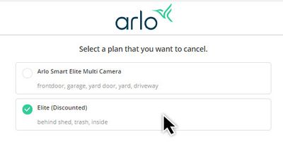
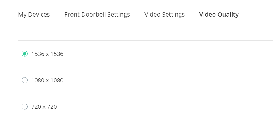
These screenshots do not do a great job representing the true UI experience (since part of it is due to positioning) but they are good examples of what I am talking about:
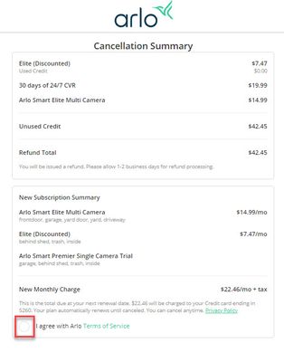
EXAMPLE #1 - I could not see there was a radio button here. I even clicked on the Terms of Service link to see if that's where I needed to agree, but there was not the option to do it there either.
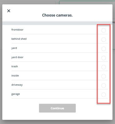
EXAMPLE #2 - The radio buttons here are again basically invisible when looking at it in the actual placement of the window on the layout of the page (the screenshot gives them a bit more visibility than what the users actually see in real life). I did attempt to select the cameras by clicking on their names, as well as clicking to the left of their names, without any success. This was actually while I was on live-chat with a support agent for over 90 minutes trying to complete the subscription process. I even sent screenshots of what I was seeing and that did not help in getting assistance to complete my order and payment.
EXAMPLE #3 - What is shown in EXAMPLE #2 could have been setup to allow users to be able to click anywhere within the line item (including the text/label of the camera and the white space around it within it's section). This form uses the same poor choice in colors BUT it does allow the users to select an item by simply clicking the words or anywhere that's blank around it within it's line item:
I happen to be technically savvy and have a good eye for color, so I can only imagine the size of your customer base who have been even more frustrated than I was, all due to these poor design choices. This not only drives down customer loyalty, but also means your company has paid for support staff that you may not have needed -- I have spent half a dozen hours either using the live-chat feature or sitting on hold waiting to speak to someone -- I have actually been on hold with them now for over 1.5 hours the entire time I've been writing this. I can only imagine the expense of paying support staff to assist customers when in reality it has been caused by simple poor design choices...
Each time I have reached out to your support crew, it was only after spending several days completely frustrated with the functionality of the web portal's settings module. technically savvy - I can't imagine how many hundreds of thousands of dollars your company has wasted paying support agents to handle frustrated customers, when in reality the underlining issue is just a terrible choice someone made on what color to use for the radio buttons on a white background.
- Related Labels:
-
Arlo Smart
-
Features
-
Troubleshooting
- Mark as New
- Bookmark
- Subscribe
- Mute
- Subscribe to RSS Feed
- Permalink
- Report Inappropriate Content
On several occasions now, I have not been able to proceed with what I was attempting to do (such as select which cameras to include in a paid subscription) or I was given the impression that what I was trying to do had actually completed (such as cancelling a CVR plan), only to find out that nothing could be finished.
However, I had an "ah-hah!" moment today. I discovered what has caused this terrible experience I've been having -- it is due to the design choices that were made for the "Settings" module of the web portal.
For users such as myself who have a monitor setup at the correct eye level positioning, we are not able to see the outlines of most radio buttons on your pages. The radio buttons are using a (basically) white color on a white background! When when they happen to be positioned in the top part of a page layout, they are slightly more visible - however when the placement is located more towards the center of the page, they might as well not even be there.
These screenshots do not do a great job representing the true UI experience (since part of it is due to positioning) but they are good examples of what I am talking about:
EXAMPLE #1 - I could not see there was a radio button here. I even clicked on the Terms of Service link to see if that's where I needed to agree, but there was not the option to do it there either.
EXAMPLE #2 - The radio buttons here are again basically invisible when looking at it in the actual placement of the window on the layout of the page (the screenshot gives them a bit more visibility than what the users actually see in real life). I did attempt to select the cameras by clicking on their names, as well as clicking to the left of their names, without any success. This was actually while I was on live-chat with a support agent for over 90 minutes trying to complete the subscription process. I even sent screenshots of what I was seeing and that did not help in getting assistance to complete my order and payment.
EXAMPLE #3 - What is shown in EXAMPLE #2 could have been setup to allow users to be able to click anywhere within the line item (including the text/label of the camera and the white space around it within it's section). This form uses the same poor choice in colors BUT it does allow the users to select an item by simply clicking the words or anywhere that's blank around it within it's line item:
I happen to be technically savvy and have a good eye for color, so I can only imagine the size of your customer base who have been even more frustrated than I was, all due to these poor design choices. This not only drives down customer loyalty, but also means your company has paid for support staff that you may not have needed -- I have spent half a dozen hours either using the live-chat feature or sitting on hold waiting to speak to someone -- I have actually been on hold with them now for over 1.5 hours the entire time I've been writing this. I can only imagine the expense of paying support staff to assist customers when in reality it has been caused by simple poor design choices...
Each time I have reached out to your support crew, it was only after spending several days completely frustrated with the functionality of the web portal's settings module. technically savvy - I can't imagine how many hundreds of thousands of dollars your company has wasted paying support agents to handle frustrated customers, when in reality the underlining issue is just a terrible choice someone made on what color to use for the radio buttons on a white background.
- Mark as New
- Bookmark
- Subscribe
- Mute
- Subscribe to RSS Feed
- Permalink
- Report Inappropriate Content
Not sure why my screenshots do not show on the post - here they are again:
EXAMPLE 1
EXAMPLE 2
EXAMPLE 3
HOW LONG I HAVE BEEN ON HOLD NOW...
- Mark as New
- Bookmark
- Subscribe
- Mute
- Subscribe to RSS Feed
- Permalink
- Report Inappropriate Content
Images posted here need to be manually reviewed/approved before they are displayed. So they won't show up instantly.
Interesting observations, and hopefully Arlo will address them.
Radio buttons and check boxes are rare in the main UI (and managing what cameras are subscribed doesn't use them). The ones I am seeing are quite visible in Edge (which is my browser of choice for Arlo, because it will play the 2K/4K videos from my Pro3 and Ultra cameras).
For example:
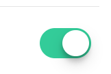
So I think they can improve the contrast. They also have a toggle switch design element that has the same semantics as a radio button, that they could easily substitute.
-
Accessories
4 -
Activity Zones
1 -
Amazon Alexa
1 -
Apple HomeKit
2 -
Apple TV App
9 -
Applications mobile et en ligne
1 -
Apps
4 -
Arlo Go
3 -
Arlo Mobile App
822 -
Arlo Pro
36 -
Arlo Pro 2
1 -
Arlo Q (Plus)
3 -
Arlo Smart
221 -
Arlo Web and Mobile Apps
18 -
Arlo Wire-Free
30 -
base station
1 -
Batteries
529 -
Before You Buy
961 -
Can't view cameras live at all
1 -
Dépannage
1 -
Détection de mouvements
1 -
Features
1,125 -
Fehlerbehebung
1 -
Firmware Release Notes
93 -
Google Assistant
1 -
Hardware
1 -
home security
1 -
IFTTT (If This Then That)
105 -
Installation
2,063 -
Iphone 14 pro
1 -
Live view
1 -
Modes and Rules
1 -
Motion Detection
2 -
Object Recognition
3 -
Online and Mobile Apps
983 -
Online und mobile Apps
1 -
Order Not Going Through... help please!
1 -
Other Discussions
1 -
Partner Integrations
4 -
Security
1 -
Service and Storage
14 -
Smart Subscription
3 -
SmartThings
71 -
Troubleshooting
9,237 -
Videos
233 -
Vidéo
2 -
Warranty & Contracts
2
- « Previous
- Next »


